Candlestick Anatomy
While in a bar chart the open and the close prices are shown by a tick on the left and the right sides of the bar respectively, however in a candlestick the open and close prices are displayed by a rectangular body.
In a candle stick chart, candles can be classified as a bullish or bearish candle usually represented by blue/green/white and red/black candles respectively. Needless to say, the colors can be customized to any color of your choice; the technical analysis software allows you to do this. In this module we have opted for the blue and red combination to represent bullish and bearish candles respectively.
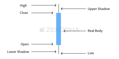
Let us look at the bullish candle. The candlestick, like a bar chart is made of 3 components.
- The Central real body – The real body, rectangular in shape connects the opening and closing price
- Upper shadow – Connects the high point to the close
- Lower Shadow – Connects the low point to the open
Have a look at the image below to understand how a bullish candlestick is formed:
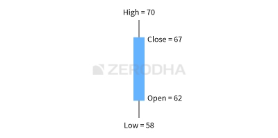
This is best understood with an example. Let us assume the prices as follows..
Open = 62
High = 70
Low = 58
Close = 67
High = 70
Low = 58
Close = 67
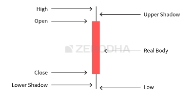
Likewise, the bearish candle also has 3 components:
- The Central real body – The real body, rectangular in shape which connects the opening and closing price. However the opening is at the top end and the closing is at the bottom end of the rectangle
- Upper shadow – Connects the high point to the open
- Lower Shadow – Connects the Low point to the close
This is how a bearish candle would look like:
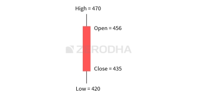
This is best understood with an example. Let us assume the prices as follows..
Open = 456
High = 470
Low = 420
Close = 435
High = 470
Low = 420
Close = 435
Here is a little exercise to help you understand the candlestick pattern better. Try and plot the candlesticks for the given data.
| Day | Open | High | Low | Close |
|---|---|---|---|---|
| Day 1 | 430 | 444 | 425 | 438 |
| Day 2 | 445 | 455 | 438 | 450 |
| Day 3 | 445 | 455 | 430 | 437 |
If you find any difficulty in doing this exercise, feel free to ask your query in the comments at the end of this chapter.
Once you internalize the way candlesticks are plotted, reading the candlesticks to identify patterns becomes a lot easier.
This is how the candlestick chart looks like if you were to plot them on a time series. The blue candle indicates bullishness and red indicates bearishness.
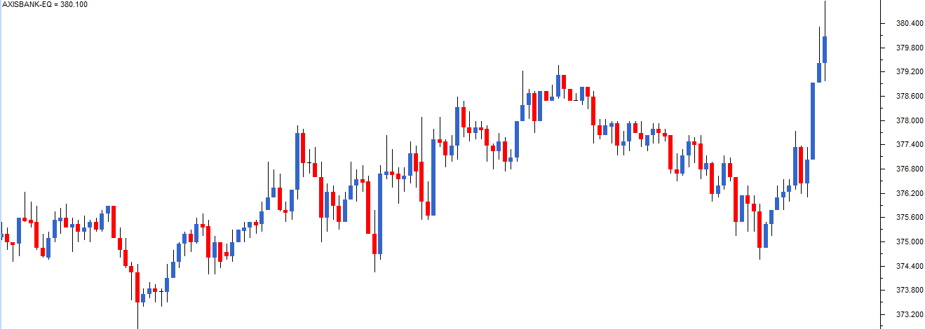
Also note, a long bodied candle depicts strong buying or selling activity. A short bodied candle depicts less trading activity and hence less price movement.
To sum up, candlesticks are easier to interpret in comparison to the bar chart. Candlesticks help you to quickly visualize the relationship between the open and close as well as the high and low price points.


No comments:
Post a Comment